OTT: Where to Invest Your UX & Design Budget

Over the years, we’ve seen lots of time and effort used inefficiently in the design and development of over-the-top (OTT) products. Typically you might expect at most 15–20% of a project budget allocated to UX and visual design, so it’s crucially important to utilise this time wisely.
One — How you research

Product owners, stakeholders, CEOs, all have their views and opinions and targets as to what they want out of an OTT product. Ultimately, none of that really matters if it’s not something your customers want to use. It doesn’t really take a genius to figure out what happens if you design a product that no one wants to use.
All too often, research is undertaken by looking at analytics, app store ratings, sending out questionnaires to users. A pop-up box might appear asking for feedback. Now these absolutely have their place, but they’re never really as insightful as you need them to be. People get bored completing them. They don’t complete them accurately, and you can never really get into the small details.
Do research face to face. Nothing can replicate the kind of feedback you’ll receive in person. Don’t just guess, and don’t just take analytics as the baseline of how that product is behaving. While you’ve got them in the room, ask them about other products they like that have nothing to do with your industry and get some feedback on that. Is there a fantastic registration or signup process that you can learn from? We advise you to create a competitor analysis document during the product’s entire lifetime.
Two — Device Performance
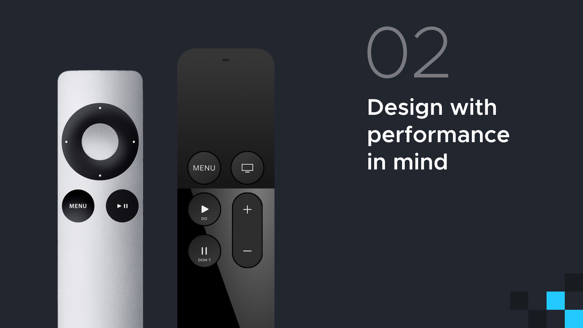
No matter how incredible the UI is that you’ve designed, if the performance of the product is sluggish, none of that really matters. Design teams have a habit of showcasing their products on the latest and greatest devices that are super quick. In reality, this might only be what a small proportion of your customers actually use. We found a huge amount of time gets wasted towards the end of production scaling down and simplifying animations. Instead, reduce the complexity of user interfaces early on.
Keep performance first and foremost in mind. Painful as it may be, you need to spend lots of time with the lowest spec devices you can possibly find. Find out what it does okay. What it does particularly badly, and keep note of that throughout the entire design process. How much content, for example, can you fit on the screen before it starts to lag?
At the same time, always make sure you’re in continual communication with the development team at all stages and make sure that every build your testing is on every single spec of device so that you don’t have any nasty surprises when it comes to launch.
Three — Cross device familiarity
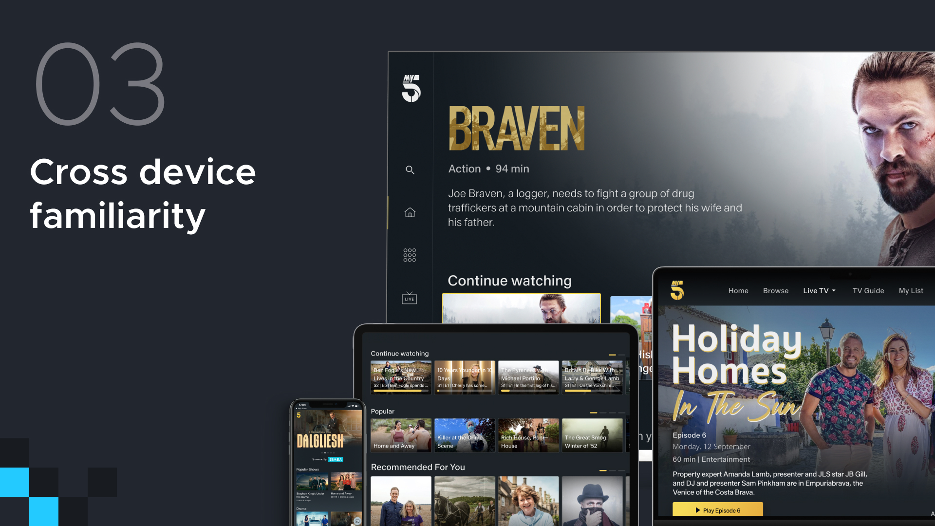
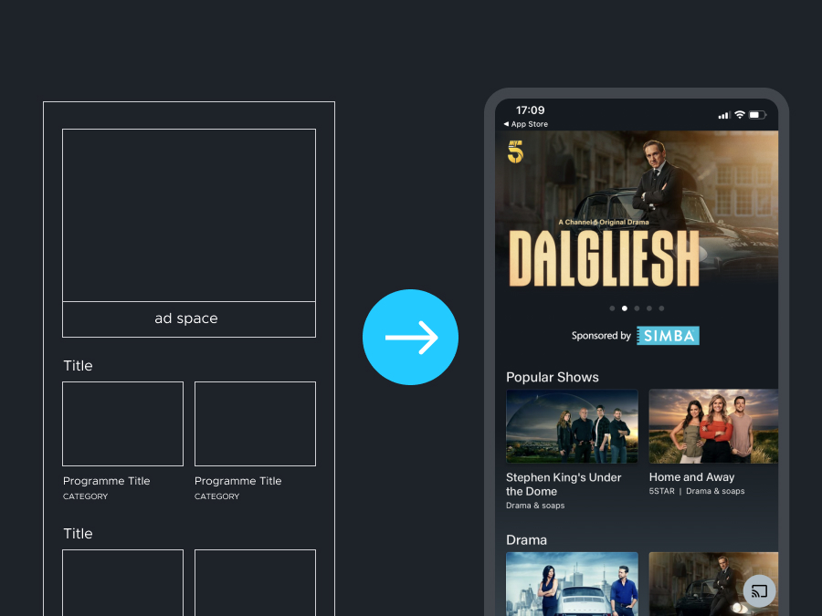
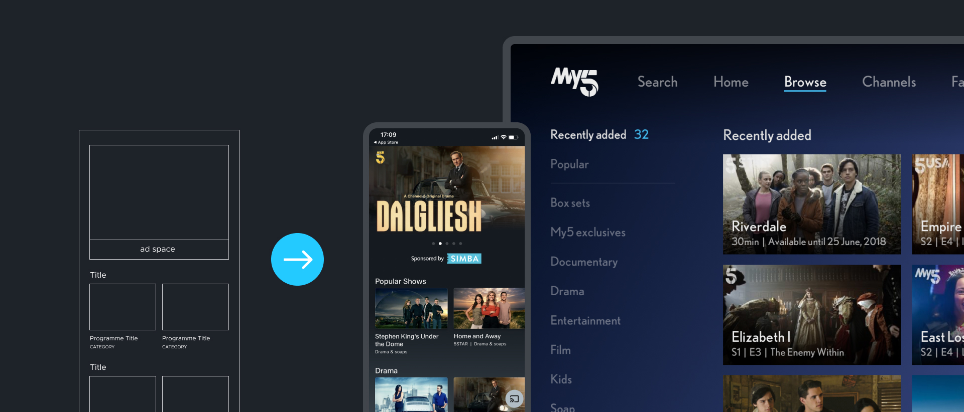
It’s very common to be tasked with designing for not just one, but for two, three, four, five or more platforms or devices simultaneously. Users have a lot of devices, and they will continually swap between these devices throughout their week. They’ll want to be able to pick up and go from where they left off, not just from resuming a program they were watching, but also how they might search for content. Cross device familiarity is incredibly important when thinking about those different use cases on different devices. You don’t want the product to feel like it’s not part of the same family.
It’s incredibly important to be very mindful that you’re not breaking the design conventions for a specific operating system in order to bring consistency. Having a central UX and design gatekeeper is incredibly useful.
Wherever possible, ensure that UX and design language are shared and in sync across all devices and platforms. You should always be continually comparing the UX and designs and builds side-by-side across different devices. It’s very important not to work in isolation.
Try and get a small start when it comes to design and development on at least one platform. On this platform, you can learn important lessons. This information can be transferred over to the other platforms and hopefully you don’t make the same mistake multiple times.
Four — Prototypes

Build prototypes as early on as possible.
We think of a picture telling a thousand words; an interactive prototype will tell 100,000 words. Prototypes get stakeholders excited. It gets everyone in the design and development teams excited because all of a sudden, the product is starting to come to life. It can help speed up sign off. It is incredibly valuable to put a prototype in front of stakeholders that they can actually feel and interact with, rather than just a series of screens that might leave a bit too much to the imagination.
Prototypes allow you to see problems very early on. It could be problems with the navigation or with controller inputs. It allows you to test different input methods, be it a controller input, a touch navigation, or more unusual inputs like magic mice on the LG TVs, for example. Additionally they’re good for is user testing. Obviously, you can put these prototypes in front of your end users and get very, very insightful feedback very, very quickly and act on that feedback in your subsequent designs.
Five — Registration and Subscriptions
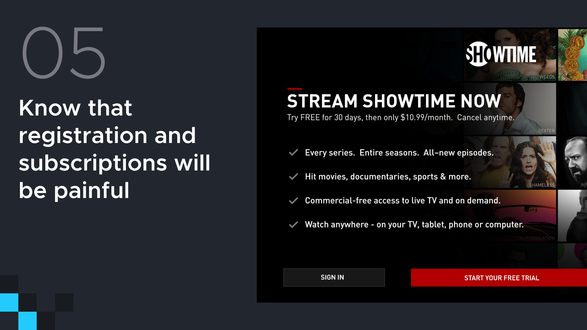
There’s a whole minefield of areas that could trip people up. These range from second screen signup, registration versus subscription. Do your users know that you need to create an account first and then buy a subscription on top of that? Potential multiple pricing tiers and free trials. Network providers and sign up by different network providers. From a practical standpoint, try and minimize the amount of unnecessarily swapping between devices that you’re asking users to do; this might include redirecting a user to a web page when they’re trying to sign up for an account on their TV in order to create an account. Only introduce swapping between different screens as an absolute necessity and make that swap as easy as possible. Rather than trying to get them to copy out long URLs, send them an SMS link or an email with the relevant link. How can you lessen the friction in all of these stages where at all possible?
Always ensure that you have adequate help and support documentation. Someone’s always going to find a way to get stuck or break it or just get plain old confused. Have somewhere for them to be able to get in contact or to read up on how they can figure out what they need to do.
Something that’s going to become very important in the very near future is The California Privacy Act. Particularly where there are financial liabilities concerned if their financial identities are tied to this, is going to make a user very angry if they trip up or have problems or feel that their data isn’t being handled in the appropriate manner. It’s one of the first things that need to be on everyone’s radar. If appropriate, get legal teams involved as early as possible. Know what you need to do with regards to GDPR if you’re launching in Europe.
These are absolute minefields and no one really knows all the ins and outs of everything you need to know, but at least get the proper teams involved at this point.
Six — Over analysing the competition

Spending an excessive amount of time looking at what competitors can do or are doing right now, can actually be quite a negative thing to do. Most importantly, it’s because you’re looking at what they have on the market today. These guys are undoubtedly working on something much bigger and much better, and they have the advantage of knowing from real world data what has worked and what hasn’t worked.
Take on board some nice things that they’re doing, just be aware that they are probably working on something that’s a lot cooler, that’s a lot slicker and you’re copying what they have today and not the next best thing is that they are working on.
Seven — Documentation
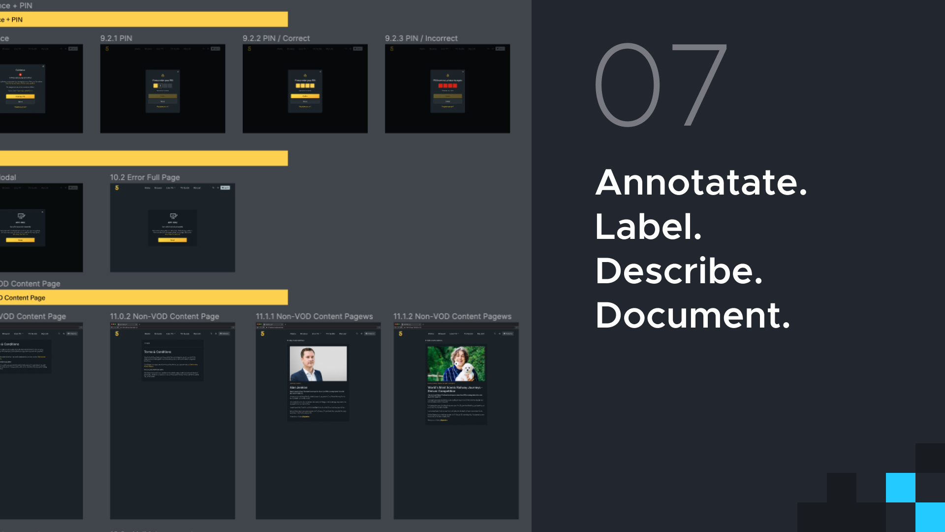
Your finished OTT product might have three, four, 500 different screen variations, and these can be variations that, are literally as subtle as a button colour change.
Suffice to say, just be really, really strict on labelling conventions, descriptions, and how you document all of this and you should be good. All of the above are the benchmarks of a solid design system; something that if well maintained, will save countless hours of design to development handover as the project progresses.
Eight — Error messaging
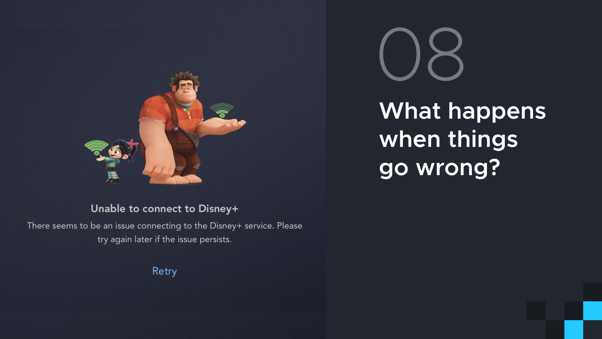
What happens when things go wrong? If you’re charging customers for access to a product, which is very common in the OTT space, no amount of great content or fancy animations is going to alleviate customer frustration or anger if they can’t get what they signed up for.
Therefore, think about how to make things fail as gracefully as possible to limit frustration. Know ahead of time what the common issues are going to be — connectivity, accounts, subscription confusion? Test those failure responses with users. Don’t just put a generic message on the screen. Do the messages make sense? Are they clear at where the fault lies? Is it something that the user can help fix? Will it be fixed in a couple of minutes and we’re aware that our system’s gone down? Test these messages and put these messages in front of users before you go live and get their feedback on it. Are the messages reassuring or are they messages that are just going to make the user frustrated? It doesn’t have to be in the state of the finished screen – you can literally just print these messages out on a piece of paper and show them to them. That level of testing it is better than nothing.
Another thing is to show error codes were available, but don’t show them prominently. Have it available somewhere on the screen because undoubtedly they’re going to go and Google it. And it may be that Googling that error code helps them resolve the issue. Keep trying to fix the issue automatically. Never have a hard stop where your platform just freezes and says “I can’t do anymore”! Always keep trying to fix the problem in the background.
Summary
As much as possible throughout the design process, try to talk to real live people, don’t rely on forms and analytics; get face to face conversations happening wherever you can.
Get prototypes for people to play with as soon as possible. You’ll find that these prototypes you create will get picked up and used throughout the entire product design life cycle.
Even before that, get your registration sorted out. This is going to be the place where you’re going to have lots and lots of issues unless it’s really well thought through.
Spend a lot of time thinking about the things that appear boring, whether it’s annotations and documentation or error messages as early as possible.
And with all of this in mind, hopefully you’ll keep your viewers happy and if you’re lucky you’ll also keep your product teams happy, as well.
UIC Digital have been designing and building OTT and streaming products for over 14 years now out of our London, New York and Budapest offices.
Talk to us about your OTT & streaming product needs.
