

- User workshops, testing and prototyping
- Bringing a network of independent apps together
- Revamping a media orchestration platform
- Totally new UX and UI
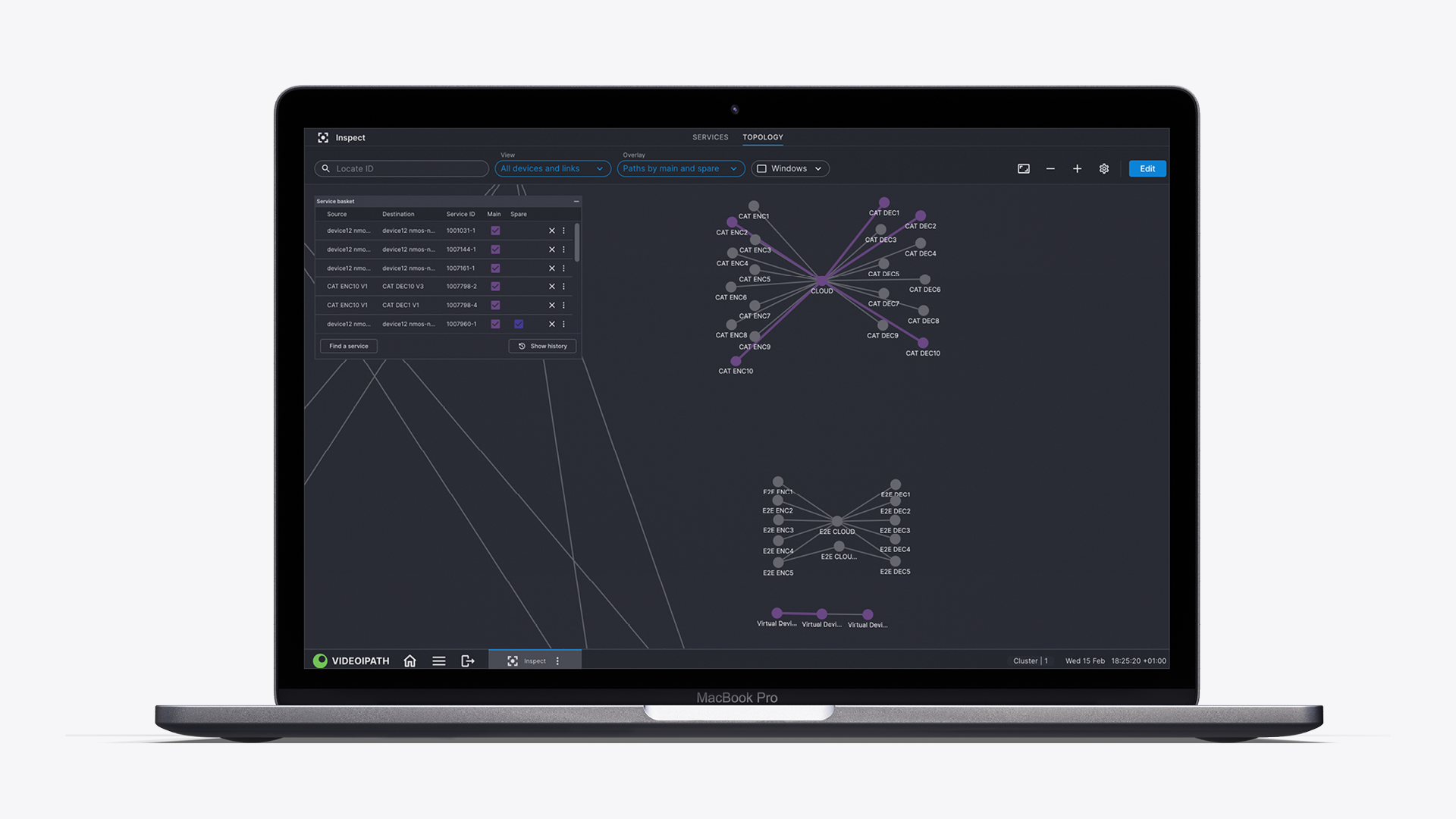
- A new Inspect topology for deep dives into product architecture
- Industry-standard alerts from toast pop-ups to action toolbars
Nevion is a global media network solutions provider, the force enabling many of the broadcasters you know and love to reach TVs in homes the world over. Its systems are complex and serve hundreds of millions of viewers every day but, over time, have become harder to use. Nevion needed a new UX and UI to make its products efficient and effective and UIC Digital was there to deliver.
Behind every great broadcaster lies an even greater media network solutions provider. Nevion, owned by Sony, is one of these providers, helping to deliver everything from Premier League coverage to Governmental network communications at global scale. Headquartered in Norway, its market-leading product VideoIPath provides a network of global pathways that take live footage from on location and deliver it to TV sets worldwide, through a series of satellites, cables, data centres and local or regional broadcasting centres.
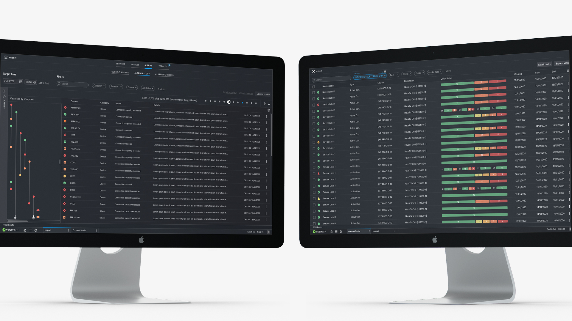
Nevion calls it a ‘media orchestration platform’, providing connection management, service assurance and network inventory capabilities for service providers and broadcasters. Engineer-led and completely focused on the practical delivery of its service, as VideoIPath had grown, its UX had become complex and its UI gradually less and less user friendly. Nevion needed a support partner to help it make the product more user-centric, without losing sight of its core proposition.
Easing pressure with game-changing UX
It’s not about user engagement. Ultimately, this is a product that is functional in nature – for heavy lifting, reactive and responsive requirements either planned in advance or during instant diagnostics for live broadcasting issues. But even the best functioning products on the planet need to be easy to use in order to function effectively.
The pressure on those using this tool can be immense – imagine serving over 550 million viewers halfway around the world, at once. So using and navigating VideoIPath has to feel intuitive, simple, stable, consistent and, above all, fast. That’s why, although some cosmetic work was done, the core of our solution revolved around solving intricate user experience problems. The product needed a new UX.
Complex tasks made seamlessly easy
Having been recommended by NEP as a result of our work there, we started, as we always do, by asking ‘why?’ Using user research, data and reported challenges, we avoid assumptions and openly discuss the problem to get to develop an understanding of what’s needed. We came at this with a fresh set of eyes, with the opportunity to take a completely new approach to the problem.
Using workshops, research, prototyping and iterative user interface design to test and learn, we began to develop solutions to complex and sophisticated problems VideoIPath users would face. That might be hundreds of system alarms firing at once, creating a network topology to view in correlation with inspecting issues or helping an engineer set-up a service path in five seconds.
From a design standpoint, we planned and prototyped for every eventuality we could think of and then implemented rapid feedback sessions with Nevion. This was the result of a partnership between the product owner and the tech team, fusing functionality for the user with the product’s technical inner-workings behind the scenes.
A harmonious network
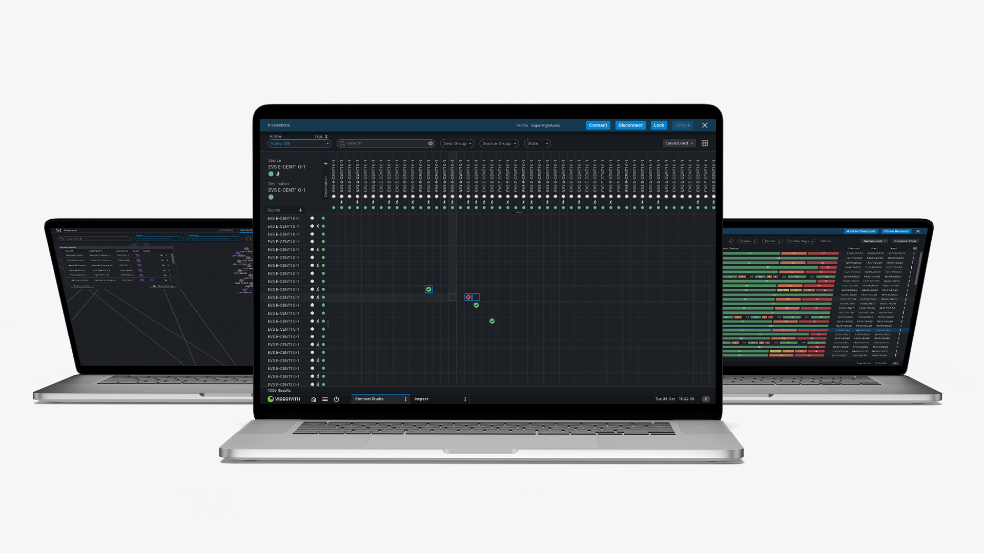
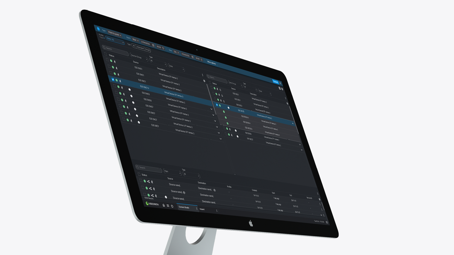
VideoIPath consists of a suite of apps, each performing very specific tasks, used by a very skilled user – like Matrix, Connect Studio, Inspect and Configuration. These apps all work independently but also need to work together harmoniously as one family.
The apps fall into one of three categories – services, assurance or configuration. The ‘services’ collection of apps set up connections, allowing audio and visual data to get from A to B at lightning speeds using pathways. This is where the magic is at. With our guidance, users can now set-up new connections in seconds. The ‘assurance’ category focuses on monitoring broadcasts, identifying issues and fixes. A large portion of our work was to understand issues with live feeds holistically, replacing the current process which often missed wider problems or patterns happening outside this macro view. Our solution was to create Inspect topology, giving users the ability to dive deep into the architecture of each problem whilst comparing other devices and ports to check for related issues.
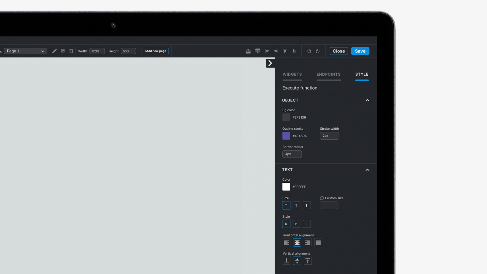
The ‘configuration’ suite of apps are more user-focused. We helped map out how users could build profiles and services efficiently that would be used continuously throughout the entire business. We hooked this up with notifications, adding industry-standard alerts like toast pop-ups and action toolbars.
A network reimagined
The result was a new UX and UI that made VideoIPath far simpler to use but no less effective at solving the complexities of delivering live events to millions of viewers globally. It had streamlined Nevion’s day-to-day and made user interactions live on location straightforward, with great feedback in tow.
What Nevion said:
“We’ve had the pleasure of working with UIC Digital for several years and, during this time, they’ve significantly improved the look and user experience of our product.
“Given the complexity of our workflow requirements and features, UIC Digital have worked in partnership to truly understand the reasons behind our needs and have taken the time and effort to build something that not only works technically but is something that is brilliantly designed and easy to use for our customers.
“The team is always very eager and extremely helpful and, with their digital product expertise, have created great design ideas that have significantly improved our product. We really enjoy this working collaboration.”

